Bring back the classic.
Everyone loves to critique a new logo design, especially a classic legecy brand. So as we kick off the new year, there is a new contender in the form of the newly abbreviated WHS, or as we all know it, WHSmith.
Now before we all go wild with accusations of 'who dun it', the high street great has called it a test across several sites. Remember..a test likely based on a smart hypothesis. Even so, this iteration likely to fall into oblivion over the next few weeks, whilst every creative agency scrabbles to pull together their gold standard pitch deck.
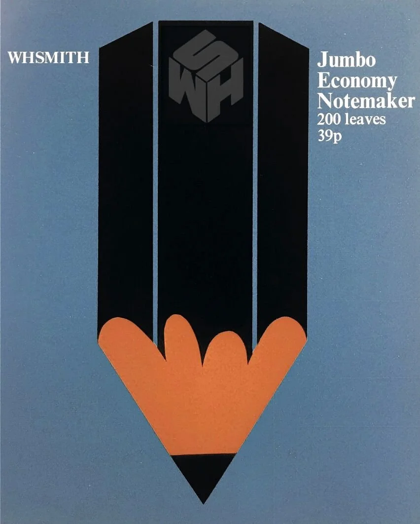
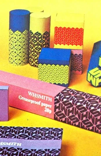
I would love to see WHSmiths leading the recovery of the high street but it needs an identify which connects to the heart. In the late 80's my father, an industrial designer, had an old WHSmiths poster on his studio wall. This poster has stuck in my memory since. In 1973 you hired one of the most respected graphic designers of all time, Dick Guyatt, through a newly created design programme, an internal department built to support your speed of expansion. He, along with a couple of others from the Royal College of Art designed your seminal 'giftbox' logo, a timeless geometric piece with a uniformity that wouldn't look out of place alongside some of the greats.
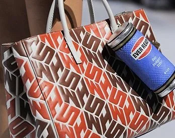
Trial it across a couple of units, spin the negativity into positive nostalgia PR that would flow in along with a design system that could be introduced back in across the estate and branded goods.
Aside from the logo misfire, a massive shout out to the WHSmith team for a +28% up on '22 revenues, driven through their adaptability, travel business and international expansion .


